Difference between revisions of "Understanding your email statistics report graphs"
Your guide to pathway services
m (Protected "Understanding your email statistics report graphs" ([Edit=Allow only administrators] (indefinite) [Move=Allow only administrators] (indefinite)) [cascading]) |
|||
| Line 6: | Line 6: | ||
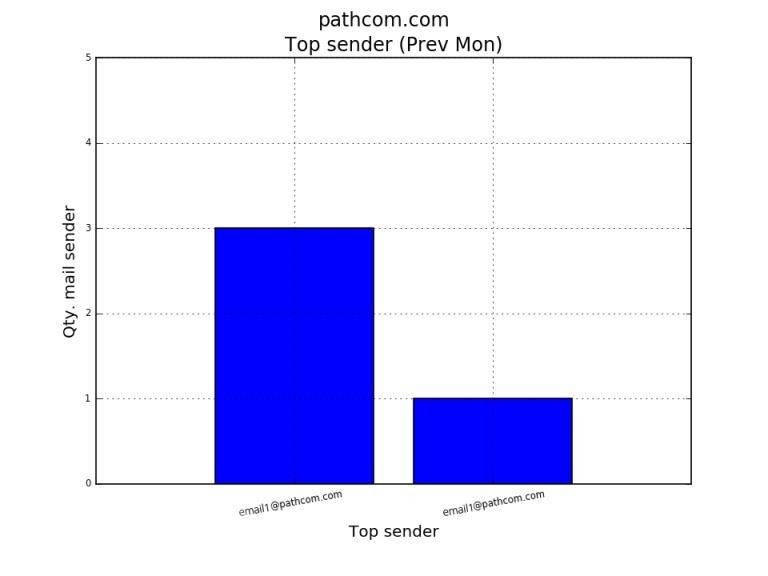
[[File:Top five mail senders prev month.jpg]] | [[File:Top five mail senders prev month.jpg]] | ||
| + | |||
| + | |||
| + | |||
| + | == '''Total number of viruses detected over the past month'''<br/> == | ||
| + | |||
| + | <br/>The graph below shows all the viruses that we detected over the past month. If any of your mailboxes (that are hosted by us) detected any viruses, they would be displayed in the graph. | ||
| + | |||
| + | |||
| + | |||
| + | [[File:Virus across all mailboxes prev month 1.jpg]] | ||
| + | |||
| + | |||
| + | |||
| + | |||
| + | |||
| + | For more information please refer to the sample [https://www.pathcom.com/wp-content/uploads/2016/06/appendix.pdf Operations Analysis Report] here. | ||
Revision as of 11:00, 6 July 2016
Total number of emails received per mailbox (over the past month)
The graph below shows the five mailboxes that received the most emails over the past month. You can use these statistics to gauge whether you should increase your mailbox sizes.
Total number of viruses detected over the past month
The graph below shows all the viruses that we detected over the past month. If any of your mailboxes (that are hosted by us) detected any viruses, they would be displayed in the graph.
For more information please refer to the sample Operations Analysis Report here.


