Understanding your Incident Report graphs
Your guide to pathway services
For more information please refer to the sample Operations Analysis Report here.
Contents |
Tickets submitted by your organization
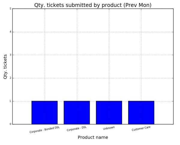
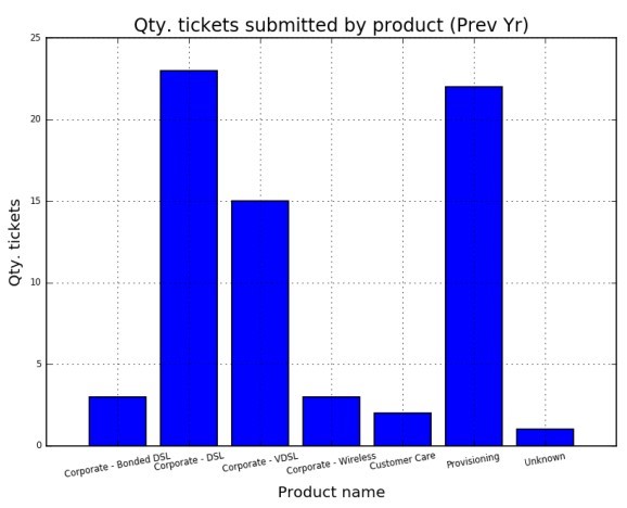
The two graphs below display all the tickets that were submitted by your organization. The first graph shows the tickets submitted over the past month, and the second graph shows the tickets submitted over the past year. Tickets are sorted by their product groups, or the department that they were submitted to, this can provide you with an idea of which of your services have required the most support over the past month, as well as the past year.
- Tickets under the Provisioning column are tickets that were opened to provision a new account or install a new product.
- Tickets under the Customer Care column correspond to attempts by our Customer Care team to reach you for service quality feedback.
- Tickets under the Unknown column are tickets that were improperly categorized.
- Tickets under a specific product column (i.e. - Corporate - DSL) are tickets that were submitted to address a request, issue, or concern related to that specific product.
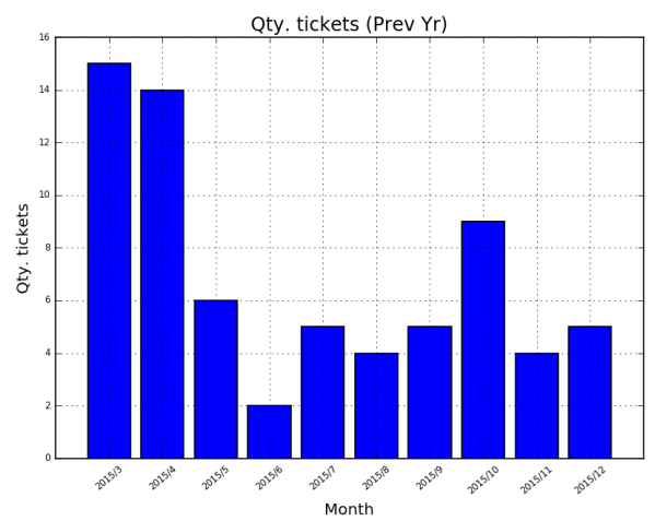
Number of tickets submitted each month (over the past year)
The graph below shows the total number of tickets submitted each month over the past year.
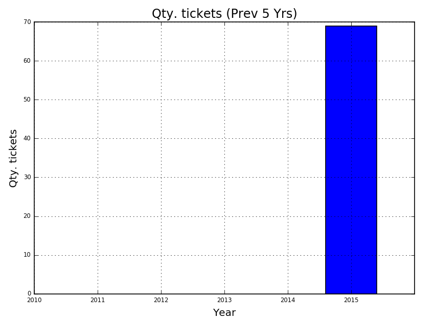
Number of tickets submitted each year (over the past five years)
The graph below shows the total number of tickets submitted each year over the past five years.
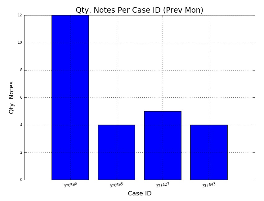
Number of notes per case
The graph below shows the total number of notes that were taken for each specific case that was opened during the past month.


