Difference between revisions of "Understanding your Average Ticket Resolution Report graphs"
Your guide to pathway services
| Line 1: | Line 1: | ||
| − | + | For more information please refer to the sample [https://www.pathcom.com/wp-content/uploads/2016/06/appendix.pdf Operations Analysis Report] here. | |
| − | + | == '''Average ticket resolution time (for the past year)'''<br/> == | |
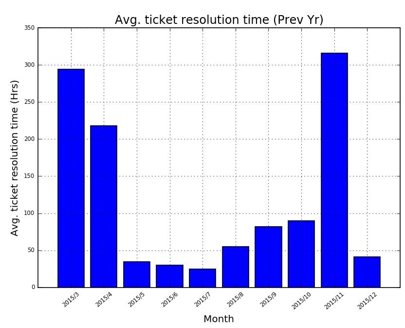
| + | <br/>The graph below shows the average number of hours that were spent on each incident, each month, over the past year. | ||
| − | + | ||
| + | [[File:Avg ticket resolution time prev year 1.jpg]] | ||
Latest revision as of 11:38, 6 July 2016
For more information please refer to the sample Operations Analysis Report here.
Average ticket resolution time (for the past year)
The graph below shows the average number of hours that were spent on each incident, each month, over the past year.


