Understanding your connectivity traffic report graphs
Your guide to pathway services
For more information please refer to the sample Operations Analysis Report here.
Bandwidth usage
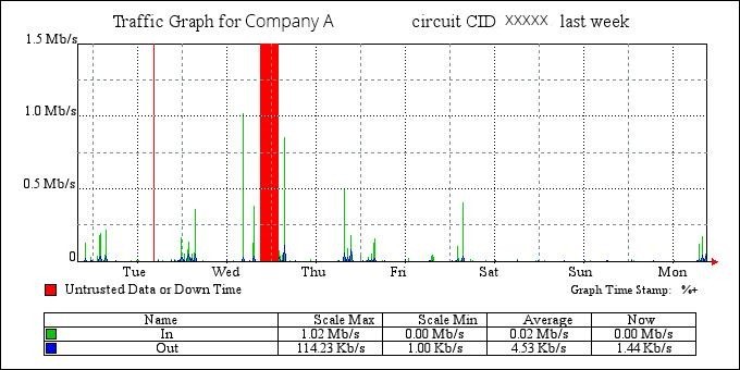
The following graph shows your bandwidth usage and speeds over the past week. Red lines denote when traffic couldn't be trusted or accurately measured; these can be caused by outages, planned maintenance, upgrades, or ambiguous data. In all cases, our support teams are alerted and create tickets to investigate these occurrences.
Bandwidth usage percentile
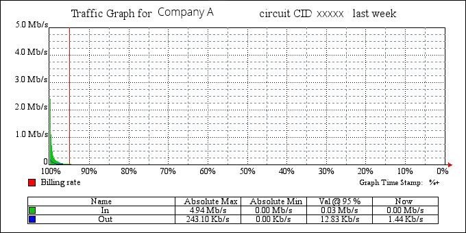
The following graph shows your bandwidth percentile usage. The red line indicates the rate where billing occurs (the 95th percentile). Billing at the 95th percentile is common, and helps eliminate peak billing (any spikes are discounted).


